Southwest – Optimize Upsell
UX design, research, and strategy.
Design Challenge
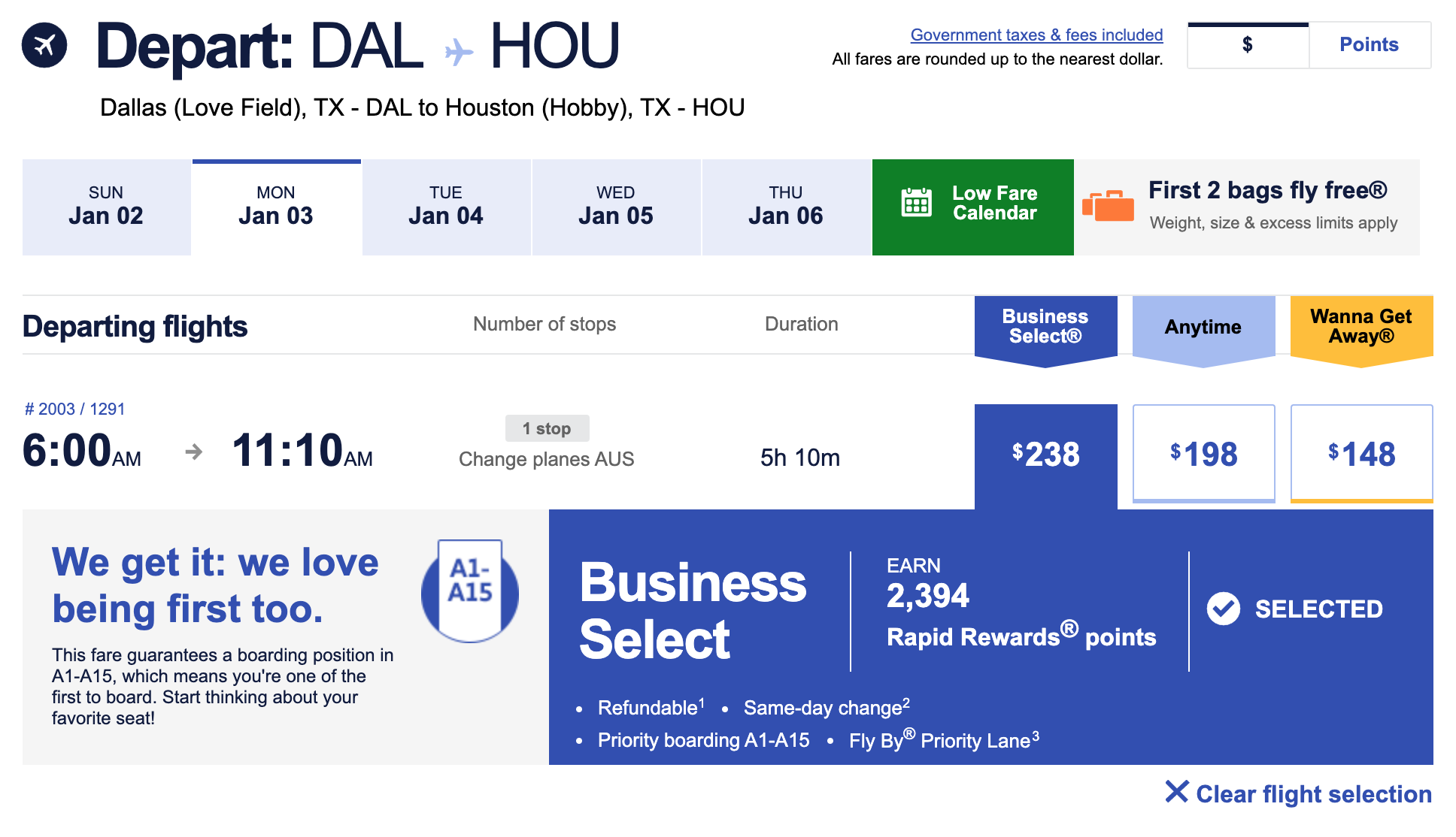
Southwest Airlines Customers can upgrade their flights from the Anytime fare to the Business Select fare while booking a flight. Business Select has the top benefits package, offering best-in-class amenities like A1-A15 boarding and a refundable ticket.
Given Southwest has a business model that separates product benefits from other airlines fare upgrades, how can we optimize upsell opportunities within the Southwest booking experiences?
WHY BUSINESS SELECT?
This product provides significant value to Southwest Customers with A1-A15 boarding and the highest points earn of any product offering. Customers with this fare have higher satisfaction in their day of travel experience, which can include premium drinks and priority security lane access. Higher satisfaction can extend to brand loyalty.
Southwest Airlines Business model
Southwest offers Business Select in lieu of other airlines’ “First Class” or “Business Class” products. Instead of a different seat type or placement on the plane, Customers get the best seat selection through a priority boarding process and an open seating policy.
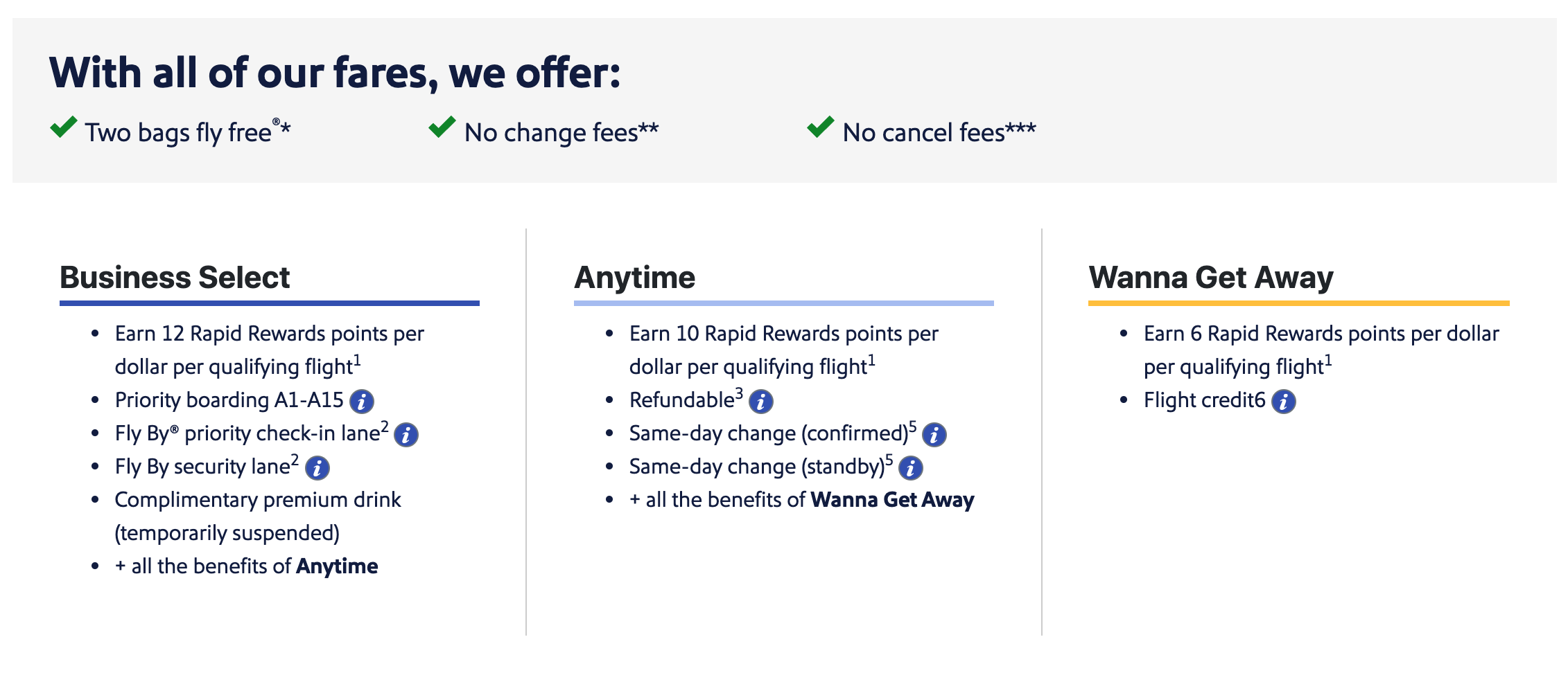
To see the full list of Business Select benefits, you can go to the Fare Types & Benefits page, an experience I’ve also had a hand in creating.
Getting to know the Customer
Through interviews with Customers, baseline usability testing, and quantitative analytics data, I’ve learned:
- A significant amount of Southwest Customers book their flights with the base fare product. Time, duration, and cost are among Customers’ prioritized needs when they go to book.
- Wanna Get Away has the highest share of brand recognition among the Southwest products due to the strength of core benefits like Bags Fly Free and no change fees. Infrequent and even frequent Customers are not overly familiar with the other fare products.
- A-List Customers within the Rapid Rewards loyalty program can board similarly to Business Select Customers, with ample seat options. Observant A-Listers may choose lower cost fares to get substantial perceived value out of a single trip.
- Because Southwest’s boarding policy affects where a Customer might sit on a plane, and other airlines typically have assigned seating, new and infrequent Customers may not see the value of upgrading to Business Select.
What Customers may be missing
- A1-A15 boarding reduces panic and anxiety from typical day of travel woes. It ensures the best access to overhead bin space, maximizes comfort with window and aisle options, and gives Customers the option to sit in the front of the plane so they don’t miss their connection.
- FlyBy lane access streamlines the check-in and security process, so Customers don’t miss their flight while waiting in lines.
- Maximized points earn leads to or can help to maintain A-list status for future flights all while stockpiling redeemable reward trips.
How might we…
better communicate to Customers the value of these benefits?
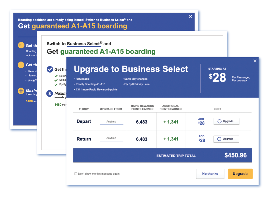
Assessing the upsell prompt
Customers who selected a fare to proceed to the Trip & Price Summary on desktop were presented with a prompt to upgrade. A few opportunities immediately stood out:
1. Optimize call to action
There’s a time and place for direct language, but we’re trying to encourage Customers to buy up. Is there a standout benefit that would catch Customers’ attention instead of “Upgrade to Business Select”?
2. Show the value
Customers may not be familiar with terms like “FlyBy Priority Lane” or “Same-day Changes.” Use clear language that communicates the value to the Customer.
3. Only show relevant information
Customers see this prompt shortly after they select a flight. Do they need heavy reminding of what fares they selected? Can we show them total points earn instead of making them do the math?
4. Use known components
Is the upgrade button a radio button or a checkbox? Can I select more than one? What if I change my mind? Using industry-established components can help meet Customer expectations.
5. Clarify or reduce complexity
Will checking “don’t show me this message again” result in never seeing this prompt? For how long? Does it work and how can I trust it? Removing unnecessarily complex functionality may be the simplest choice.
6. Avoid dark patterns
Using “upgrade” as the primary call to action can feel forceful and make Customers uneasy. Upgrades should be encouraged but optional.
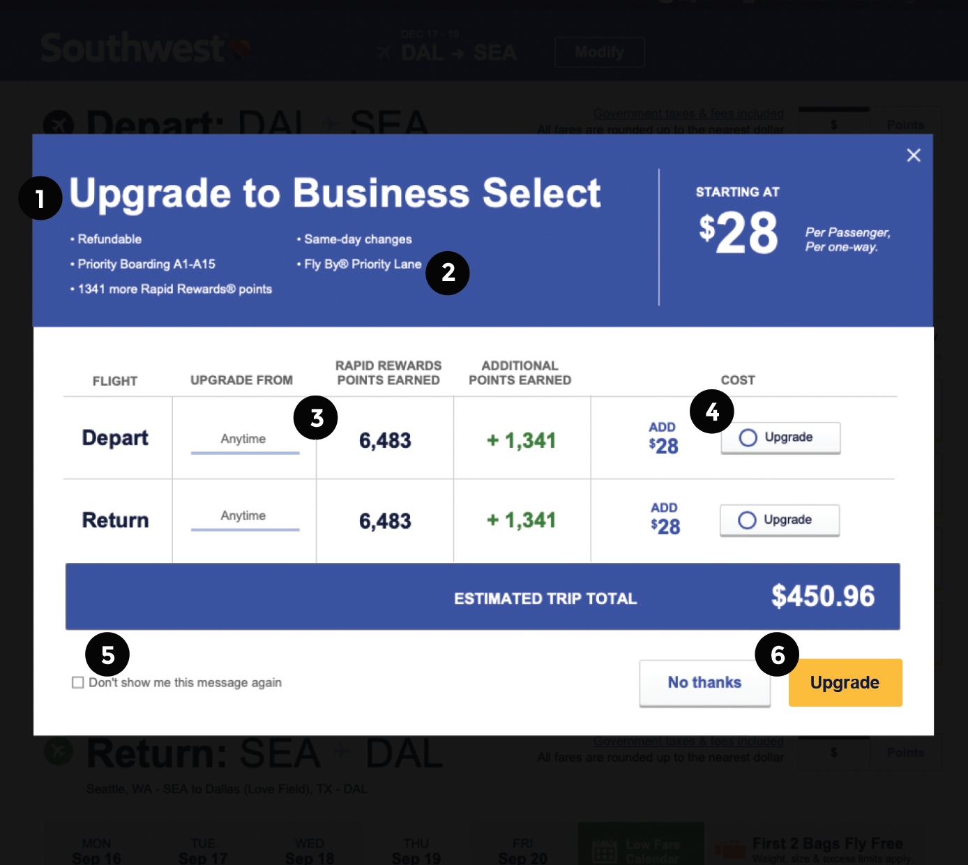
Prompts like these can often be disruptive to Customers quickly trying to complete a transaction. Reducing how much a Customer has to read or think can benefit the overall purchase experience.
Testing alternate designs
By A/B Testing multiple designs with the prompt, and the booking path without the prompt, we determined this type of upsell was too disruptive and contributed significantly to the exit rate.
Back to the drawing board
After discovering how disruptive the prompt was to Customers and how much this affected the bottom line, we searched for other ways in which we could introduce these great benefits to Customers.
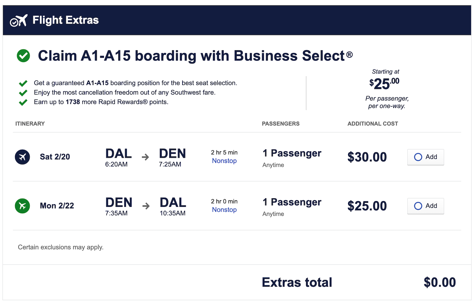
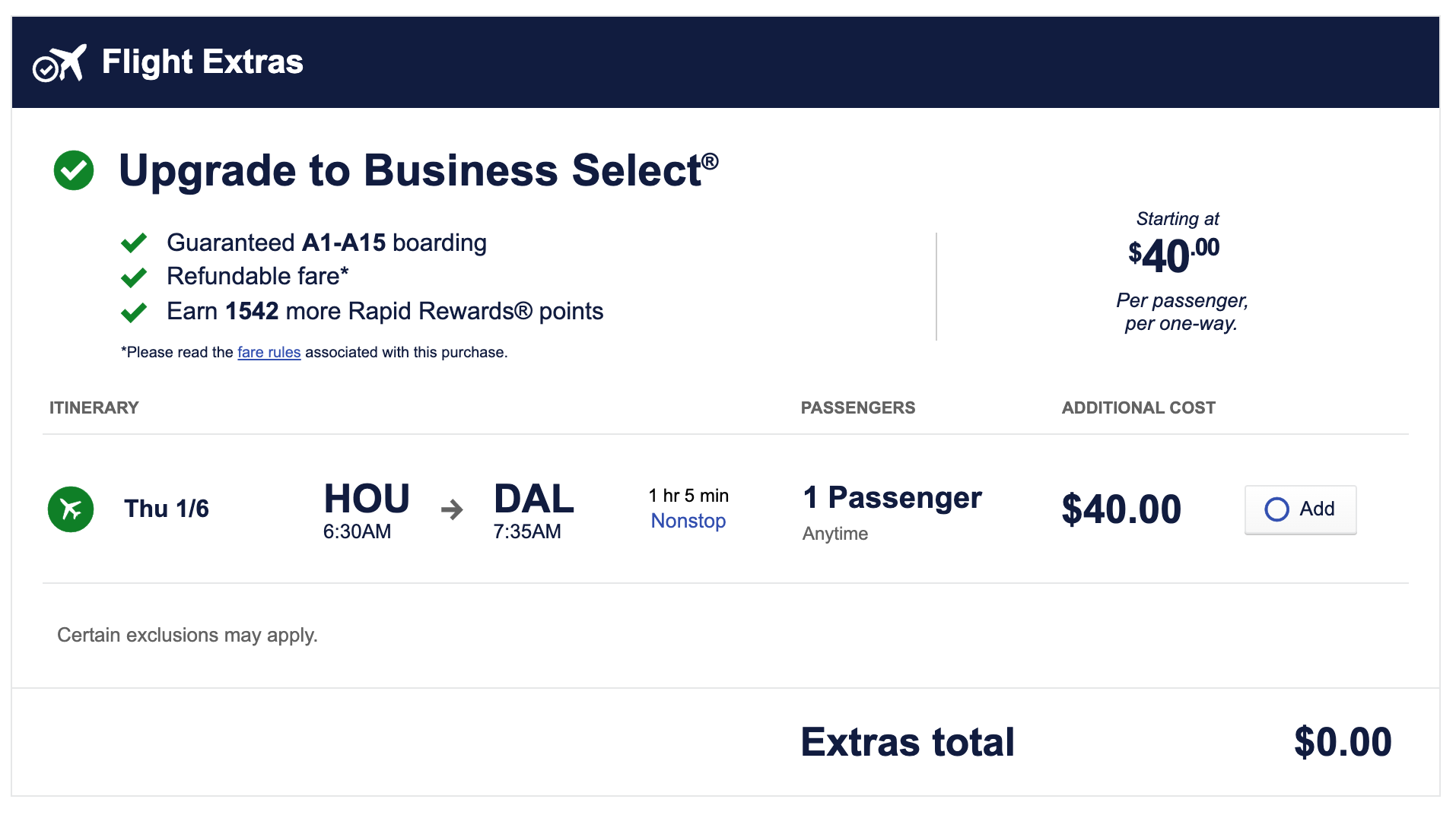
For this design iteration, we prioritized avoiding dark patterns and “used car lot” sales tactics by exploring concepts that add on to the existing Trip & Price Summary.
In usability testing, participants preferred concepts that used clear language and educated the value of the benefits they were purchasing. All options shown directly on the Trip & Price page were seen as “less annoying to frequent travelers” and “more personalized” than the more disruptive modal prompt.
A/B Testing Results
Stakeholders chose to A/B test Trip & Price page designs with the existing language. While the new design shown focused on only one or two recommendations, the impact was substantial. These changes increased Business Select transactions +37% and made no substantial impacts to the exit rate.
Mobile Upsell Summary
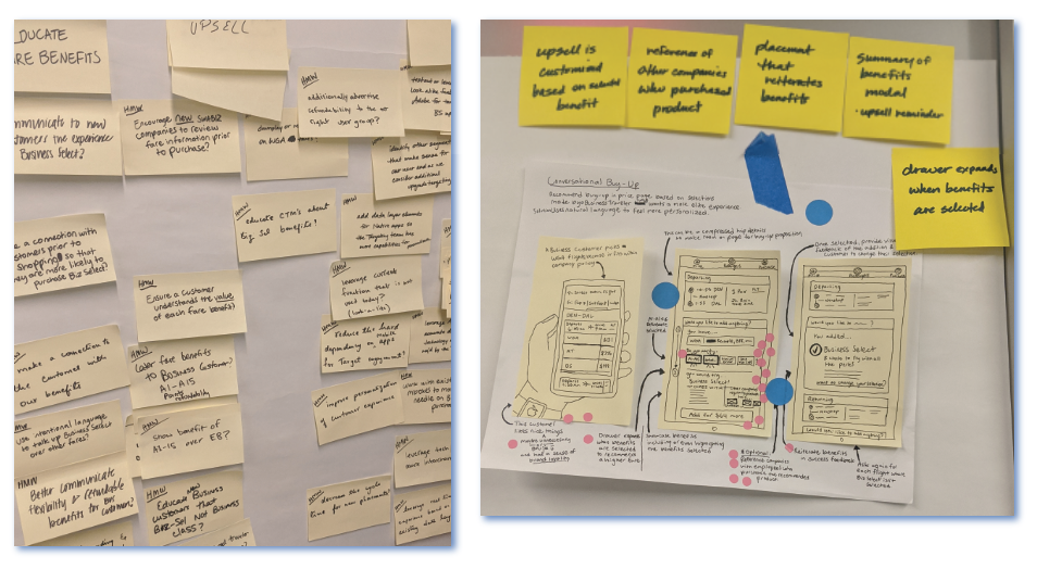
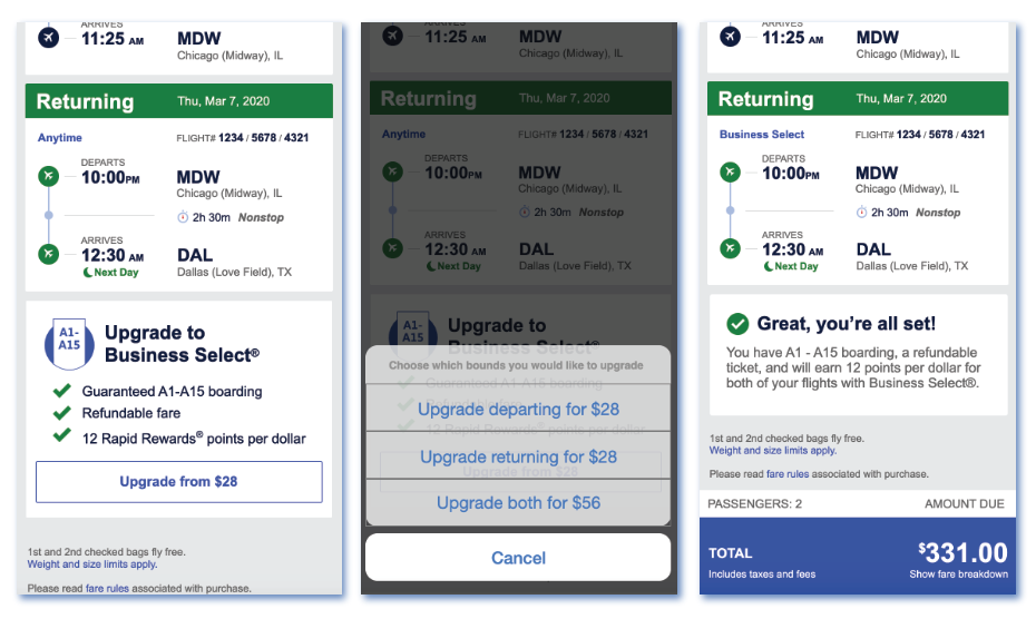
Following the work we did to improve the desktop upsell, we conducted a 5-day design sprint for mobile. Because the platforms are built differently, target different Customers, and have different functionality, we brought in subject matter experts from Customer Relations and Technology to further understand how we might bring similar functionality to mobile platforms.
DESIGN SPRINT
We defined the problem we were trying to solve on monday, discovered competitive ideas and sketched solutions tuesday, voted on a solution to move forward wednesday, prototyped the design thursday, and usability tested the design with real Customers on friday.
Conclusion
A similar Trip & Price Summary placement was created for mobile platforms with functionality that could be built quicker and with less complexity. A/B Testing and launch of the mobile Trip & Price page design resulted in +88% Business Select Transactions.
Takeaways
Iterating on tiny details can have big impacts. Here are a few ways we could move the needle:
- Try out friendlier informative messaging to further communicate the value of the benefits offered on desktop.
- Swap out the add button/checkbox/radio on desktop with a more standard design pattern.
- Allow Customers the flexibility to remove upgrades without going back, if they change their mind.
Many people came together to optimize these experiences, but I’d like to give special thanks to Lynn Bruns, Alicia Knight, Nick Wood, Anna Howe, Angelique Woodward, and Qi Fu for helping us see these through.
Any questions?
Thank you for your interest in my work. Feel free to ask me anything.
